Showing posts with label jquery. Show all posts

Thursday, 17 January 2019

Touch UI - Hide/Show fields inside coral-3 multifield in AEM by coral dropdown

This post shows how to hide/show fields inside multifield in the Touch UI dialog of AEM.
The resourceType used here for composite multifield, selection dropdown, textfield and numberfield are coral 3 ui components. For ex: granite/ui/components/coral/foundation/form/multifield and it has been tested in aem 6.3.

This method uses granite:class attribute added as property to add class in the fields and granite:data node with data key-value added as property to add data attributes in the fields.
Implemented 4 steps are mentioned below: 

1. Add granite:class attribute to the selection field as shown below
 granite:class : cq-dialog-dropdown-showhide1


2. Add granite:data node inside selection field with data key-value added as property as shown below:
cq-dialog-dropdown-showhide-target1 : .list-option-listfrom-showhide-target


3. Add granite:class attribute to each of the fields which you want to show/hide based on 
dropdown selection which matches the data-target attribute of selection field as shown below:
granite:class : list-option-listfrom-showhide-target1


4. Add granite:data node inside each of the fields which you want to show/hide with showhidetargetvalue key 
and value equal to dropdown options value as shown below:
  showhidetargetvalue : textval


To avoid any confusion, the cq_dialog xml i created is pasted below-

<?xml version="1.0" encoding="UTF-8"?>
<jcr:root xmlns:sling="http://sling.apache.org/jcr/sling/1.0" 
xmlns:granite="http://www.adobe.com/jcr/granite/1.0" 
xmlns:cq="http://www.day.com/jcr/cq/1.0" 
xmlns:jcr="http://www.jcp.org/jcr/1.0" xmlns:nt="http://www.jcp.org/jcr/nt/1.0"
    jcr:primaryType="nt:unstructured"
    jcr:title="Multi ShowHide Component"
    sling:resourceType="cq/gui/components/authoring/dialog"
    helpPath="https://www.adobe.com/go/aem6_3_docs_component_en#Image - HTL">
    <content
        jcr:primaryType="nt:unstructured"
        sling:resourceType="granite/ui/components/foundation/container">
        <layout
            jcr:primaryType="nt:unstructured"
            sling:resourceType="granite/ui/components/foundation/layouts/tabs"
            type="nav"/>
        <items jcr:primaryType="nt:unstructured">
            <multi
                jcr:primaryType="nt:unstructured"
                jcr:title="Multi"
                sling:resourceType="granite/ui/components/foundation/section">
                <layout
                    jcr:primaryType="nt:unstructured"
      sling:resourceType="granite/ui/components/foundation/layouts/fixedcolumns"
                    margin="{Boolean}false"/>
                <items jcr:primaryType="nt:unstructured">
                    <custom
                        jcr:primaryType="nt:unstructured"
      sling:resourceType="granite/ui/components/foundation/container">
                        <items jcr:primaryType="nt:unstructured">
                            <heading
                                jcr:primaryType="nt:unstructured"
      sling:resourceType="granite/ui/components/foundation/heading"
                                class="coral-Heading coral-Heading--4"
                                level="{Long}4"
                                text="Composite Multifield"/>
                            <well
                                jcr:primaryType="nt:unstructured"
      sling:resourceType="granite/ui/components/foundation/container">
                                <layout
                                    jcr:primaryType="nt:unstructured"
      sling:resourceType="granite/ui/components/foundation/layouts/well"/>
                                <items jcr:primaryType="nt:unstructured">
                                    <fieldenter
                                        jcr:primaryType="nt:unstructured"
      sling:resourceType="granite/ui/components/coral/foundation/form/multifield"
                                        composite="{Boolean}true">
                                        <field
                                            jcr:primaryType="nt:unstructured"
      sling:resourceType="granite/ui/components/coral/foundation/container"
                                            fieldLabel="Products Container"
                                            name="./products">
      <items jcr:primaryType="nt:unstructured">
                                            <listFromMulti
      granite:class="cq-dialog-dropdown-showhide1"
                                            jcr:primaryType="nt:unstructured"
      sling:resourceType="granite/ui/components/coral/foundation/form/select"
                                            fieldLabel="Select Multi showhide"
                                            name="listFromMulti">
      <items jcr:primaryType="nt:unstructured">
                                            <text
                                            jcr:primaryType="nt:unstructured"
                                            text="Text field"
                                            value="textval"/>
                                            <num
                                            jcr:primaryType="nt:unstructured"
                                            text="Num field"
                                            value="numval"/>
                                            </items>
                                            <granite:data
                                            jcr:primaryType="nt:unstructured"
      cq-dialog-dropdown-showhide-target1=".list-option-listfrom-showhide-target1"/>
                                            </listFromMulti>
                                            <multitext
      granite:class="list-option-listfrom-showhide-target1"
                                            jcr:primaryType="nt:unstructured"
      sling:resourceType="granite/ui/components/coral/foundation/form/textfield"
                                              fieldLabel="Multi Text"
                                              name="multitext"
                                              showhidetargetvalue="textval">
                                              <granite:data
                                                jcr:primaryType="nt:unstructured"
                                                showhidetargetvalue="textval"/>
                                              </multitext>
                                              <multinum
      granite:class="list-option-listfrom-showhide-target1"
                                              jcr:primaryType="nt:unstructured"
      sling:resourceType="granite/ui/components/coral/foundation/form/numberfield"
                                              fieldLabel="Multi Num"
                                               name="multinum"
                                               showhidetargetvalue="numval">
                                               <granite:data
                                               jcr:primaryType="nt:unstructured"
                                               showhidetargetvalue="numval"/>
                                               </multinum>
                                            </items>
                                        </field>
                                    </fieldenter>
                                </items>
                            </well>
                        </items>
                    </custom>
                </items>
            </multi>
        </items>
    </content>
</jcr:root>

Now to toggle fields using selection dropdown inside composite multifield independently, use below jquery logic 
written in a js file inside clientlibs folder of component with category cq.authoring.dialog .
 
(function(document, $) {
    "use strict";

    // when dialog gets injected
    $(document).on("foundation-contentloaded", function(e) {
        // if there is already an inital value make sure the 
  //according target element becomes visible
        showHideHandler($(".cq-dialog-dropdown-showhide1", e.target));
    });

    $(document).on("change", ".cq-dialog-dropdown-showhide1", function(e) {
        showHideHandler($(this));
    });

    function showHideHandler(el) {
        el.each(function(i, element) {
                // handle Coral3 base drop-down
                Coral.commons.ready(element, function(component) {
                    showHideCustom(component, element);
                    component.on("change", function() {
                        showHideCustom(component, element);
                    });
                });
        })
    }

    function showHideCustom(component, element) {
         // get the selector to find the target elements. 
         //its stored as data-.. attribute
       var target = $(element).data("cq-dialog-dropdown-showhide-target1");
       var $target = $(target);
       var elementIndex = $(element).closest('coral-multifield-item').index();

       if (target) {
         var value;
         if (component.value) {
           value = component.value;
         } else {
           value = component.getValue();
         }
         $(element).closest("coral-multifield-item").find(target)
         .each(function(index) {
            var tarIndex = $(this).closest('coral-multifield-item').index();
            if (elementIndex == tarIndex) {
                $(this).not(".hide").parent().addClass("hide");
                $(this).filter("[data-showhidetargetvalue='" + value + "']")
                .parent().removeClass("hide");
            }
         });
        }
    }

})(document, Granite.$);

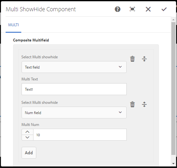
The screenshot of how the dialog looks like and how it toggle fields is shown below- 


You can also find this component in my github project here .

Tuesday, 1 May 2018

Touch UI - Hide/Show Fields in the dialog in AEM by selection/checkbox

In this post, I'll cover 2 methods to hide/show fields in the touch UI dialog of AEM.
One is the OOTB method provided by aem for toggling fields based on dropdown selection field and other method is toggling fields programmatically based on any resourceType (checkbox, selection etc.) 

Method 1 -
This method uses some class and attributes provided by AEM OOTB which is applicable to only toggle fields based on dropdown selection and thus is the easiest way to achieve hide/show.

First, you have to add below 2 properties to the selection field as shown below:

class : cq-dialog-dropdown-showhide
cq-dialog-dropdown-showhide-target : .list-option-listfrom-showhide-target


Then, add another 2 properties to each child container which you want to show/hide based on dropdown selection:
class : hide list-option-listfrom-showhide-target
showhidetargetvalue : field11

Thus for any child containers which you want to hide/show- add a class property which matches the data-target attribute of selection field as shown above and add another property of showhidetargetvalue with value equal to dropdown options value.


Method 2 -

This method is a generic method and you can use it to hide/show fields based on any resourceType like chekbox or selection etc. Here, I'll toggle fields using jQuery logic written in a js file inside clientlibs folder with category cq.authoring.dialog .

To use this method, add any attribute (I've added listener) to checkbox(or selection) field and child fields which you want to toggle and give any value which u'll be using it as an identifier in js file as shown below:


Now, use the below logic applied when the dialog is loaded and fetch the checkbox value using listener and toggle fields whichever you want using listeners. 
(function (document, $) {
    'use strict';
 var CHECKBOX_LIST = 'touch.checkbox';
 var FIELD5_LIST = 'touch.field5'
 var FIELD6_LIST = 'touch.field6';

$(document).on("foundation-contentloaded",function () {

 var $dialog = $(document).find('.cq-dialog');

 function showhideCheckbox() {
   var isChecked = false;
   var isTextfield = false;
   var el = $dialog.find("[data-listener='" + CHECKBOX_LIST + "']");
   if (el[0] !== undefined) {
 isChecked = el[0].checked;
   }
   if (isChecked === true) {
 $dialog.find("[data-listener='" + FIELD5_LIST + "']").parent().show();
 $dialog.find("[data-listener='" + FIELD6_LIST + "']").parent().hide();
   }  
   else {
 $dialog.find("[data-listener='" + FIELD5_LIST + "']").parent().hide();
 $dialog.find("[data-listener='" + FIELD6_LIST + "']").parent().show();
   }
}

  var checkBtn = $("[data-listener='" + CHECKBOX_LIST + "']").closest('.coral-Checkbox');
  if (checkBtn.length === 1) {
 showhideCheckbox();
 checkBtn.on('click', function () {
  showhideCheckbox();
 });
  }   
});
})(document,Granite.$);

And at the last, if you are using acs-commons package in your project, then it already provides showhidedialogfields.js in clientlibs which you can directly use without using any of the above methods.
It provides an extension to the standard dropdown/select and checkbox component. But It enables hiding/unhiding of multiple dialog fields based on the selection made only in the dropdown/select or on checkbox check.

Sunday, 15 April 2018

Touch UI Validation in AEM - using jQuery and Granite UI (Part 2)

In this post, you'll know how you can validate the fields in the touch ui dialog of AEM using jQuery logic for validation and Granite UI to prompt error.
To use foundation-validation validator for touch ui validation, refer this post.

The entire logic for validation can be written in JS code as shown below which you can put in clientlibs and add the categories of clientlibs as cq.authoring.dialog

For ex. I am doing the validation for a phone number field which accepts only 10 digit numbers in the dialog.
(function (document, $, ns) {
    "use strict";
    $(document).on("click", ".cq-dialog-submit", function (e) {
        e.stopPropagation();
        e.preventDefault();
 
        var $form = $(this).closest("form.foundation-form"),
            symbolid = $form.find("[name='./symbol']").val(),
               message, clazz = "coral-Button ",
         patterns = {
             symboladd: /^([0-9]{10})\.?$/i
        };

        if(symbolid != "" && !patterns.symboladd.test(symbolid) && (symbolid != null)) {
                ns.ui.helpers.prompt({
                title: Granite.I18n.get("Invalid Number"),
                message: "Please Enter a valid 10 Digit Phone Number",
                actions: [{
                    id: "CANCEL",
                    text: "CANCEL",
                    className: "coral-Button"
                }],
            callback: function (actionId) {
                if (actionId === "CANCEL") {
                }
            }
        });
        }else{
                 $form.submit();
        }
    });
})(document, Granite.$, Granite.author);
As seen from the above code snippet, you can get the dialog element value using name and apply the regex pattern test to validate the field and then with the Granite ui, you can prompt the validation fail message as shown below: